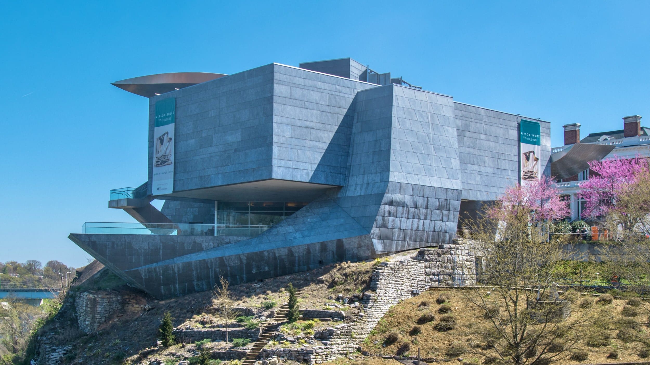
Perfectly Perforated
31 inspirational projects featuring custom perforated metal.
It was just over ten years ago that perforated metal entered into a new era, a golden age for metal imagery created through selective perf. For many years, perforated metal was an industrial product. Today, perforated metal is part of a new renaissance.
Over the early 1990’s, patterned usage of perforated metal began to appear. At the time, the pattern were limited by programming. It wasn’t until the early two-thousands, when Herzog & de Meuron designed the de Young Museum, that perforated metal would truly enter into its own.
Below is a listing of 31 inspirational examples of custom perforated metal, each manufactured by Zahner, which show how far the medium of perforated metal has grown — and also how much room there is for it to grow.
1. DE YOUNG MUSEUM (2005)
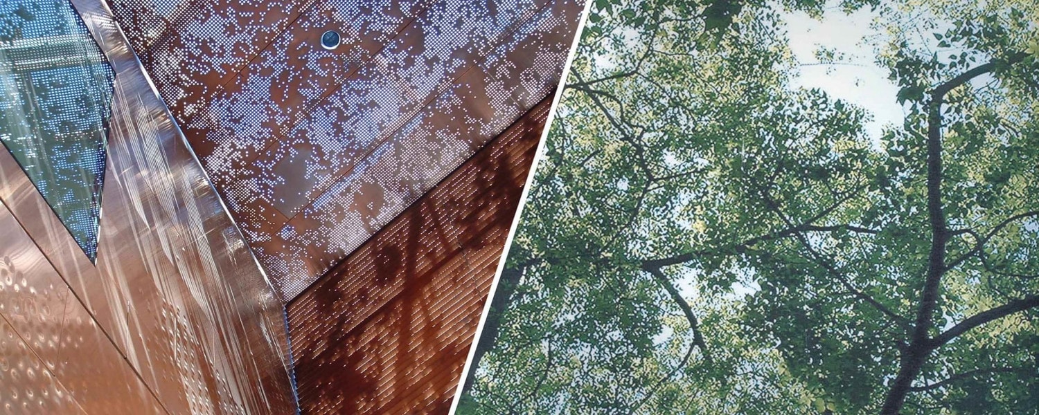
We begin with Herzog & de Meuron’s design for the de Young Museum, which features a perforated screen skin designed to mirror the green foliage and forestry of the surrounding Golden Gate Park. This skin was the first breakthrough use and development of the Zahner-patented ZIRA technology. This enabled designers to take a photographic image (in this case a view looking up through a canopy of trees) and use an algorithmic process to convert the image into an offset pattern that lines up seamlessly when assembled on the building.
Today we’ve designed multiple technologies based on the ZIRA patent, each of which enable designers to convert imagery — from the ImageWall app, to the Louvered ZIRA technology for louvered 3D perforations, to the custom automated embossing for generating unique dimples, bumps, and embossed shapes in the surface of metal.
2. NOISETTE BANDSHELL AT POINT PAVILION (2005)

The Noisette Bandshell at Point Pavilion was designed by BNIM to create a community space for public performance in Charleston, SC’s Riverfront Park. Aluminum shading panels are hung from galvanized wire cable stretched between custom-rolled galvanized steel pipe. The panels were punched into a pattern resembling woven baskets indigenous to the region.
3. NISSAN STYLING STUDIO COURTYARD (2005)

Nicknamed “the egg”, this exterior courtyard for Nissan Design America was designed to showcase new technologies and concept cars. A double-layered custom perforated metal skin allows the studio to maintain the privacy of these innovative vehicles, while still providing natural light and a sophisticated backdrop for their latest designs.
4. HOI POLLOI (2006)
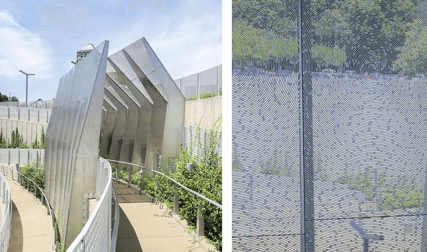
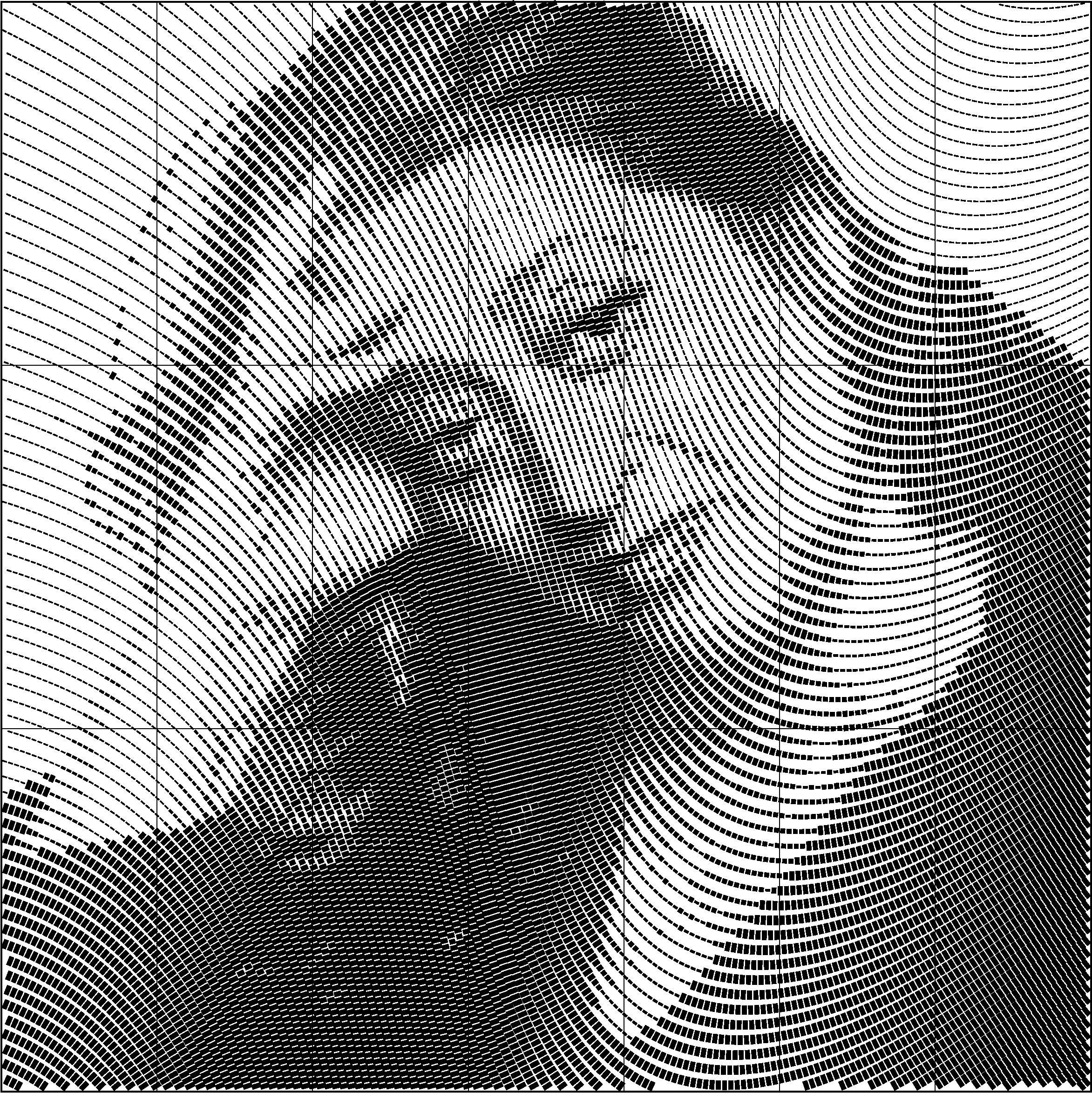
Radial perforation pattern for the Hoi Polloi public artwork in University City, Missouri.
PHOTO © A. ZAHNER COMPANY.
One of nine commissioned public artworks for the St. Louis railway extension, Hoi Polloi was designed by artist Lindsey Stouffer to explore the way a person thinks and feels when entering a public space. The installation is composed of four large metal screen assemblies divided by the metro’s train tracks. Radial perforations in the screens create a moiré effect, making the surface shimmer as viewers descend into the amphitheater-like space of the below-grade, open-air station.
5. BALL STATE (2006)

Professor Kevin Klinger’s immersive design studio at Ball State University gives students a first-hand experience translating digital designs into a permanent installation. The students used generative processes to design perforation and folding patterns applied to a sculptural ribbon of weathering steel. They worked directly with Zahner to detail and fabricate the sculpture, which was then installed on campus where students could observe the weathering steel patina develop into the protective layer of oxidation that prevents it from corroding and gives it the bright umber tone it is known for.
6. POWER & LIGHT BRIDGE (2008)

Stretching across the submerged Interstate Highway 635 in downtown Kansas City, the Power & Light Bridge carries electricity across the primary conduits that service the city. Designed by Helix to evoke the sine waves of three-phase electrical power, the utility box is wrapped in a dynamic skin of 375 unique black zinc panels, assembled into a surface of undulating folds. A pattern of custom perforations, bumps and dimples was generated from an iterative collaboration between Zahner and the architect to resemble an electron field. Interior LEDs creates a show of light and shadow that make the bridge a distinctive new icon bridging the gab between Kansas City’s business district and downtown arts district.
7. KAUFFMAN STADIUM (2009)

Perforated interior screen for Kauffman Stadium.
Photo © Mike Sinclair
This renovation of Kauffman Stadium, home to the Kansas City Royals, features a new structure wrapped in stainless steel panels. Two sections use selective perforations and bumps that paint the Royals logo across this surface, calling to fans as they approach the stadium. Up close, this custom perforated metal system provides daylight, air circulation, and visual excitement that builds the energy of those fans as they enter and move through the stadium.
8. ALEXANDRIA PARKING STRUCTURE (2009)

The Mission Bay Block 27 parking structure in San Francisco, CA uses an image of redwoods made into a custom perforated metal screen. The bronze-anodized aluminum screens were punched with a set of elliptical shapes. The panels fold and play off of the massive base of the garage, giving a vitality and playfulness to the design.
9. 41 COOPER SQUARE (2009)

Copper Union’s new academic building, known simply by its address 41 Cooper Square, features an ambitious design by Morphosis that covers a full block on Third Avenue from East 6th to East 7th in downtown Manhattan. The futuristic building is wrapped in a high-performance metal skin that controls sunlight and insulates in cold weather, resulting in a 50% reduction of heat load on the building. The pattern of custom perforations forms a number of opaque rectangles that scatter across the surface of individual panels, each of which is operable by custom actuator accessed from inside the glass windows on the interior of the building.
10. SILVER TOWERS (2009)

River Place II, also known as Silver Towers, is a structure of two identical 57-floor towers connecting by a six floor plinth. An interior courtyard within the plinth features an innovative use of custom perforated panels, a 75-foot light wall whose illuminations appears to be filtered through vines and branches. This ambient effect is achieved by translating a flora pattern designed by the architect into perforations on metal panels that are contained within glass and stainless steel lightboxes. This elegant motif is repeated in lighting and architectural fixtures throughout the rest of the building.
11. DEE & CHARLES WYLY THEATRE (2009)

Heralded by critics as one of the most intelligently conceived performance centers in the world, the Dee & Charles Wyly Theatre is a traditional and experimental performance center for music, performance arts, and cinema designed by REX Architecture and Rem Koolhaus OMA. The exterior façade of aluminum columns resembles the billowed fabric of a closed curtain, but is actually an assembly of custom-fabricated metal panels. There is a line of perforations integrated into the panels that are backed by an interior LED, revealing a vertical column of text that makes the signage for the building.
12. LUMENHAUS (2009)

The Lumenhaus is an eco-conscious portable housing prototype collaboratively designed by students at Virginia Tech. This solar, pre-fab housing project is based on Bauhaus principles imbued with 21st century technologies. Sliding screens with perforated metal flaps allow for the house to be opened into a free-flowing system where occupants are tied both to each other within the house and to the landscape outside of it. These screens also perform as solar barriers, deflecting the harsh rays of the setting sun.
13. FAIRMONT PACIFIC RIM (2010)

The Fairmont Pacific Rim is a 44-story hotel in downtown Vancouver just blocks from the rocky shores of the Pacific Ocean. The architects at James KM Cheng channeled this natural context into a custom perforated screen system that disguises the first few floors of the hotel’s office and parking structures.
The perforations in the metal surface provides natural light and air circulation, and their pattern gives the building a nuanced, organic visual effect. The image of Redwood trees was translated by ZIRA technology into the perforation patter, combined with bumps and dimples on custom Angel Hair-finished steel. The resulting effect is of a shimmering curtain on which trees appear to emerge and recede as if drifting through a coastal fog.
14. SFMTA KIOSKS (2010)

The San Francisco Cable Cars are a living piece of history that still traverse the city to this day. These two ticket booths for the San Francisco Municipal Transportation Agency provide entry onto the cable cars while themselves representing the marriage of history and the present day. The top of the booths are wrapped in stainless steel that is custom-perforated to display historic imagery of the street cars, elegantly integrating their nostalgic image with the slick steel box of the kiosk below. At night, the panels are backlit with LEDs, creating a bold beacon visible from all sides.
15. IRVING CONVENTION CENTER (2010)
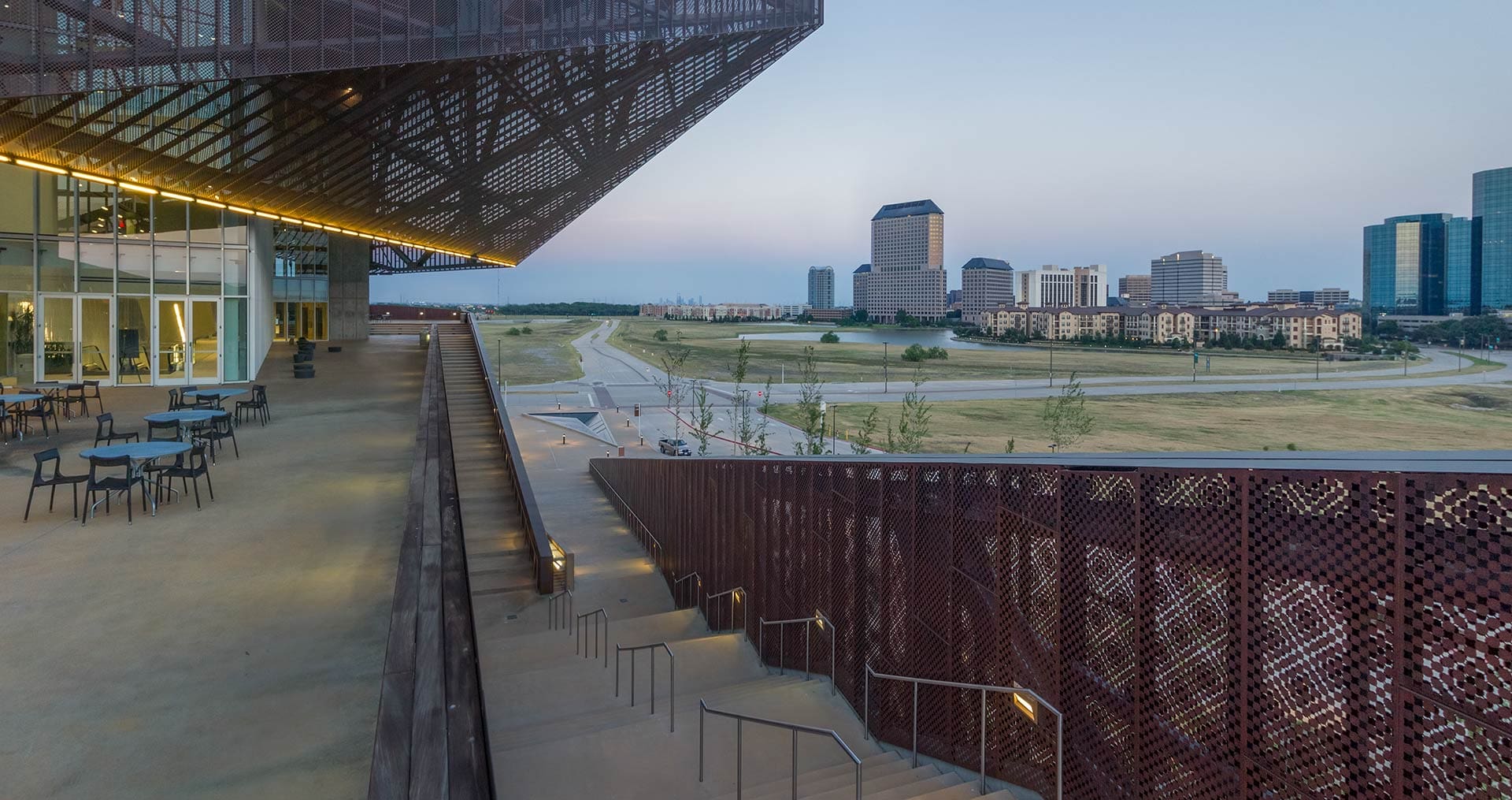
Designed by RMJM + Hiller in 2010, the Irving Convention Center at Las Colinas, TX is skinned entirely in a copper curtain wall. This wall is perforated and bumped in a custom-designed pattern that was carefully developed by the architect to achieve a specific optical effect. When the two layers are overlapped, it creates a moiré effect, and its uniquely designed die-punch pattern gives the skin an appearance all its own. This feeling of transformation in the building’s skin is added to by the elongated process of the mill-finish copper’s patination. First darkening and eventually changing to greens and blues, the building will continue to change over time.
16. HELIX, ART WALL AT HBKU DOHA UNIVERSITY (2010)
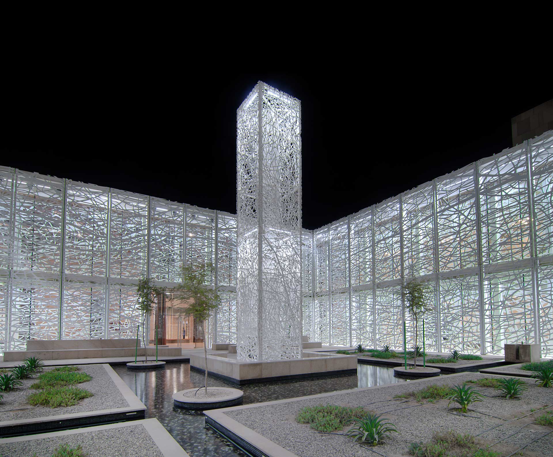
Jan Hendrix is an artist that frequently collaborates with Zahner to produce sculptural works from his highly-intricate drawings. In 2010, he worked again with Zahner as well as the architectural firm Legoretta & Legoretta to produce Helix, a public artwork and courtyard at HBKU Doha University’s student center. Hundreds of unique 20’x8’ aluminum panels form a 40’ high tower in the center of the courtyard and its surrounding interior and exterior surfaces. Using the ZIRA Process and working closely with the artist to digitally detail the image, Zahner ensured that the waterjet-cut panels would form a cohesive composition with smooth lines flowing across each individual piece.
17. THE DREAM HOTEL DOWNTOWN (2011)

The Dream Hotel in Downtown New York City is Handel Architects’ renovation of Albert Ledner’s iconic Ninth Avenue structure. Built in 1966 as an annex for the Maritime Union, the building was most recently known as the Covenant House homeless shelter. After the 2011 renovation, the building is now a world-class hotel, visible from the newly-completed Highline Park in Chelsea. The renovation clad the building in a stainless steel façade, which appears to be perforated by the building’s iconic porthole windows. The southern façade is a true custom perforated screen, with large round openings that carry over the typology from Ledner’s original design. Smaller perforations and a soft finish with medium reflectivity were developed for an ambient feeling that evoke’s the hotel’s name.
18. DENNY’S FLAGSHIP (2012)

An undulating net of yolk-yellow waves defines the Denny’s flagship restaurant in Las Vegas. This location is a marker of the transformation of the Denny’s brand, and SITE Architects consulted with Zahner to explore materials and processes that would come to shape the architecture behind the new brand identity. Aluminum surfaces with a milled interlocking system were all custom designed to create a visually seamless surface for the Diner of the Future.
19. WINDMOOR CENTER AND CHAPEL OF ST. JOSEPH, ST. TERESA’S ACADEMY (2012)

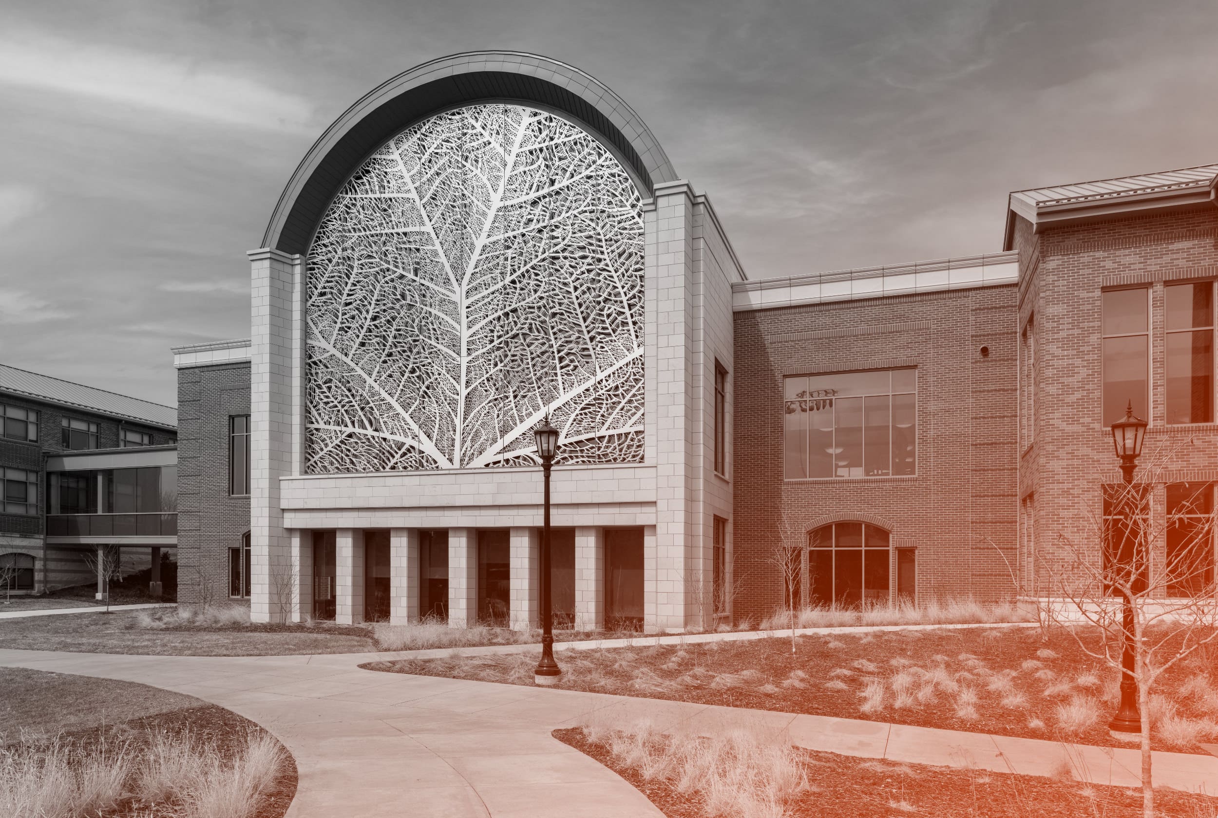
St. Teresa’s academy built the Windmoor Center and Chapel of St. Joseph to provide students and faculty with a light-filled, contemplative space. Designed by Gould Evans, this structure has a metal skin water-jet cut in the form of a delicate, feminine veil evoking the school’s namesake, St. Teresa, the patron saint of Lacemakers. From the exterior, it is a dramatic gesture that makes the new structure an anchor for the whole campus. Inside the building, it creates an intimate experience, casting intricate shadows across the walls of the Chapel.
20. CROSSTOWN SUBSTATION (2013)

Pendulum’s design for Kansas City’s Crosstown Substation takes a simple barrier wall around an electrical substation and incorporates elements of public art, architecture, and kinetic motion-based visual arts. A weathering steel ribbon bends and folds from the top of this wall. Its surface features a warm patina which will perform excellently against Kansas City’s seasonal weather and contrast boldly against the adjacent white surface of the wall’s base. Vertical panels break up the unprogrammed sections of the façade. Perforated cylinders bring this effect onto the sidewalk, projecting unique light and shadow effects on the concrete at night.
21. THE MAST AT SAN DIEGO CENTRAL LIBRARY (2013)

The new nine-story San Diego Central Library is home to numerous artworks incorporated throughout the building. Spanning four floors of the building’s north façade, The Mast is an illuminated aluminum column whose diameter ranges from 8” at top and bottom and 12” at its center. The lower portion of the 70’ tall mast is perforated with a custom pattern that is backlit by an interior system of LEDs, creating a start-studded beacon that illuminates the concrete façade through the evening hours.
22. SHILEY SPECIAL EVENTS SUITE AT SAN DIEGO PUBLIC LIBRARY (2013)

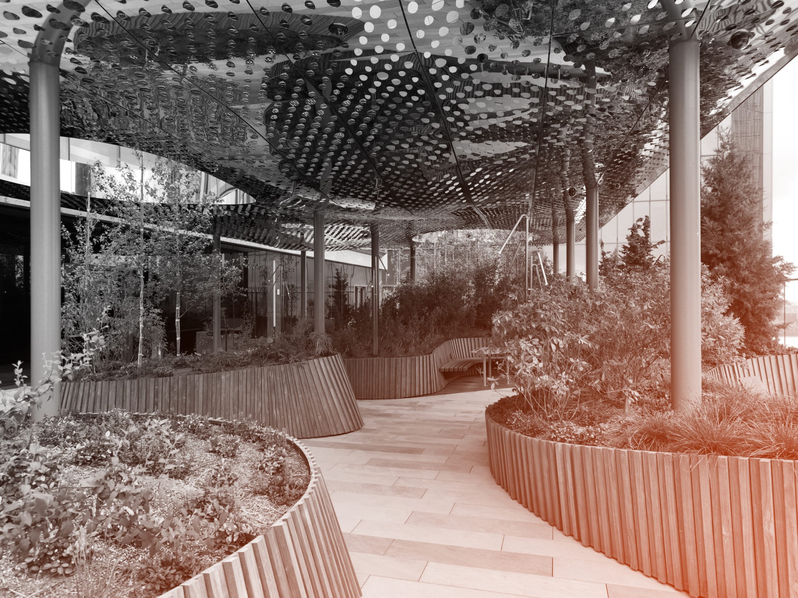
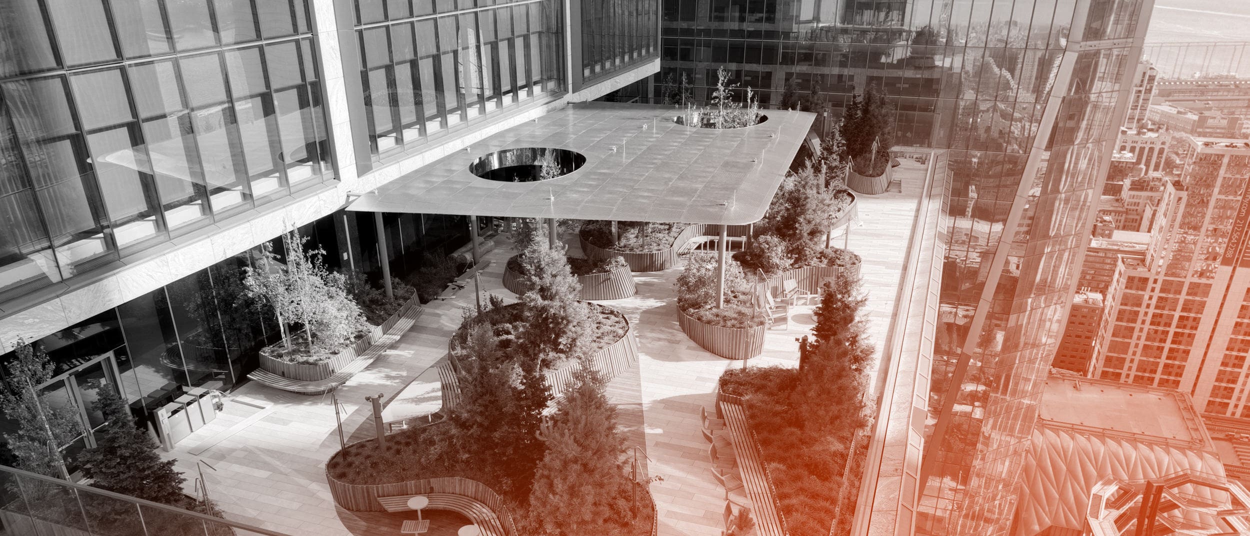
Also a part of the new San Diego Public Library is the Shiley Special Events Suite, a rooftop facility for the library’s special programming. The entrance to the suite is lined with panels of interference-coated stainless steel mounted with a muted seam across which custom perforations line up perfectly. The vibrant surface reflects the light and motion of the rooftop space, creating an energetic transition for patrons attending special events.
23. HOOVER GARAGE (2013)
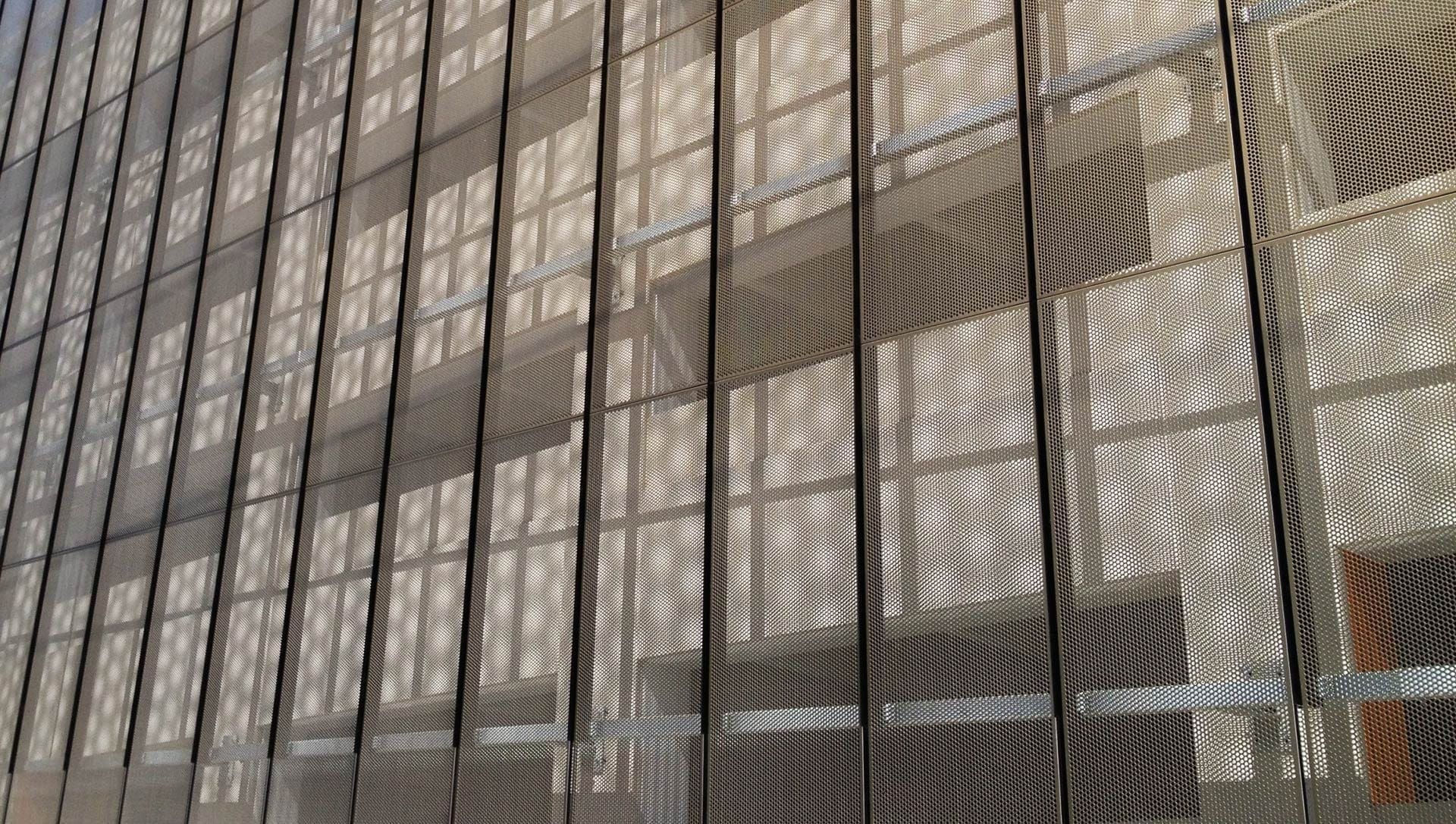
The Hoover Garage at Stanford Hospital and Clinics at Stanford University was designed by WRNS Studio in a simple and sharp design. To achieve the visual clarity desired, Zahner worked closely with the architects to develop a system of 3/16” perforated panels with cut and grooved backsides for a defined edge. An additional vertical extrusion was also designed that, compared to the originally-planned design for a steel member with its own complex support system, reduced parts and cost as well as satisfying the aesthetic goals of the clients.
24. GULF ISLANDS RESIDENCE (2013)

The Gulf Islands Residence is a remote single-family house on an island near the rocky shores of Vancouver. AA Robins Architects designed the building to reflect the ebb and flow of the surrounding landscape. It is clad throughout with Zahner’s Solanum Steel, and its patinated panels provide a vibrance and warmth that compliment the surrounding blue ocean and sky. High windows are perforated in custom rock-shaped patterns that cast playful shadows shadows as the sun moves across the sky.
25. HIGHLAND PARK COMMUNITY CENTER (2014)

When LSE Architects were designing Minnesota’s Highland Park Community Center, they wanted a sign that would exemplify the facility’s connection with the surrounding area. They used Zahner’s ImageWall system to generate a custom perforated pattern, forming a birds-eye view of the meandering Mississippi River. The image flows across 20 panels coated with a custom Angel Hair finish, giving the image the appearance of being rendered in soft silver tones.
26. JOHN W. OLVER TRANSIT CENTER (2014)
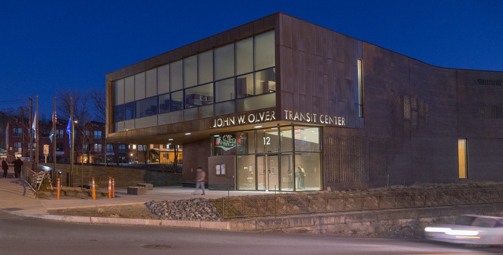
Greenfield, Massachusett’s new transit center, designed by Charles Rose Architects, is skinned in a naturally weathering copper façade. Intricate perforations are strategically cut into this surface, integrating signage and light filtering screens into the sharp rectangular masses of the building’s modern design.
27. GATES HALL AT CORNELL (2014)

Morphosis Architects worked with Zahner to design and fabricate the facade of Cornell’s new home for Computing and Information Science (CIS). The Bill & Melinda Gates Hall is wrapped in a skin of highly-customized metal panels that appear to be launching into flight from the surface of the building. Close collaboration with the full project team optimized the design of the panel system as well as the fabrication and installation process. This Design Assist process reduced cost, waste, and construction delays. These angular sunshades also contribute to the building’s LEED Gold Status.
28. CERNER HEADQUARTERS NAVIGATIONAL DISPLAYS
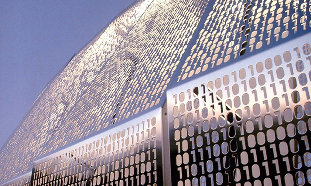
Cerner Corporation in North Kansas City develops innovative technologies and systems for the health care industry. To showcase this fusion of technology and individual care, Gould Evans designed two highly sculptural navigational displays with custom perforations in a non-repeating pattern of binary 1’s and 0’s. The larger of the two displays, produced with embedded lighting systems, appears to flash and animate when viewed from the neighboring 210 Highway.
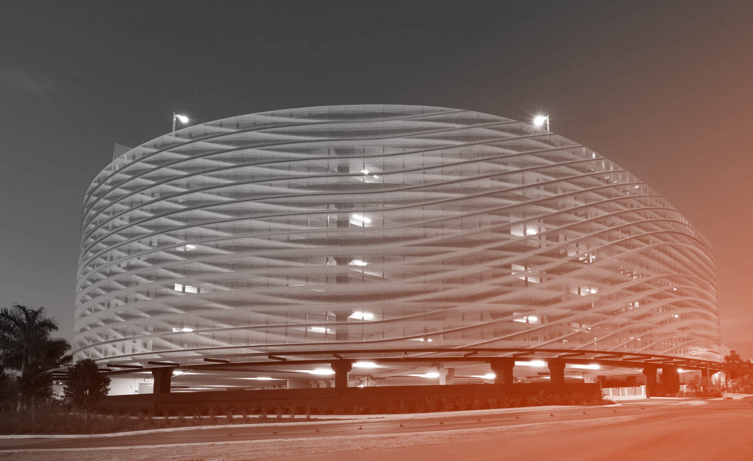
29. FUN ONE, CITY VIEW GARAGE (2015)
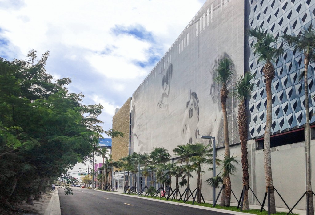
The City View Garage in Miami’s Design District features three distinctive facades conceived as public art installations on the pedestal of a parking garage. Three facades, by Leong Leong, Iwamoto Scott, and John Baldessari, were each design-engineered and manufactured by Zahner, who worked closely with each project team to develop processes and technologies customized for each section.
The central facade, running parallel to the neighboring I-90, is John Baldessari’s massive stainless steel artwork entitled Fun One. The work is an image selected from his extensive collection of found production stills rendered onto panels using Zahner’s ZIRA technology. Paired with its partner, Fun Two, a billboard on the structure’s opposite facade, Fun One infuses the new landmark structure with a nostalgia and playfulness that compliment the Design District’s creative identity.
30. LEONG LEONG FACADE, CITY VIEW GARAGE (2015)

This façade is one of three that skin the distinctive new landmark for Miami’s Design District. Leong Leong’s facade features a surface of curvilinear shapes punched and bent out of gold-colored titanium-coated stainless steel curves around the Southwestern corner of the open-air parking area. From the exterior, the highly textured and reflective surface creates a shimmering effect, like light on the surface of water. Inside, the wave-like openings create a patterned view of the city while allowing air to circulate naturally throughout the floors.
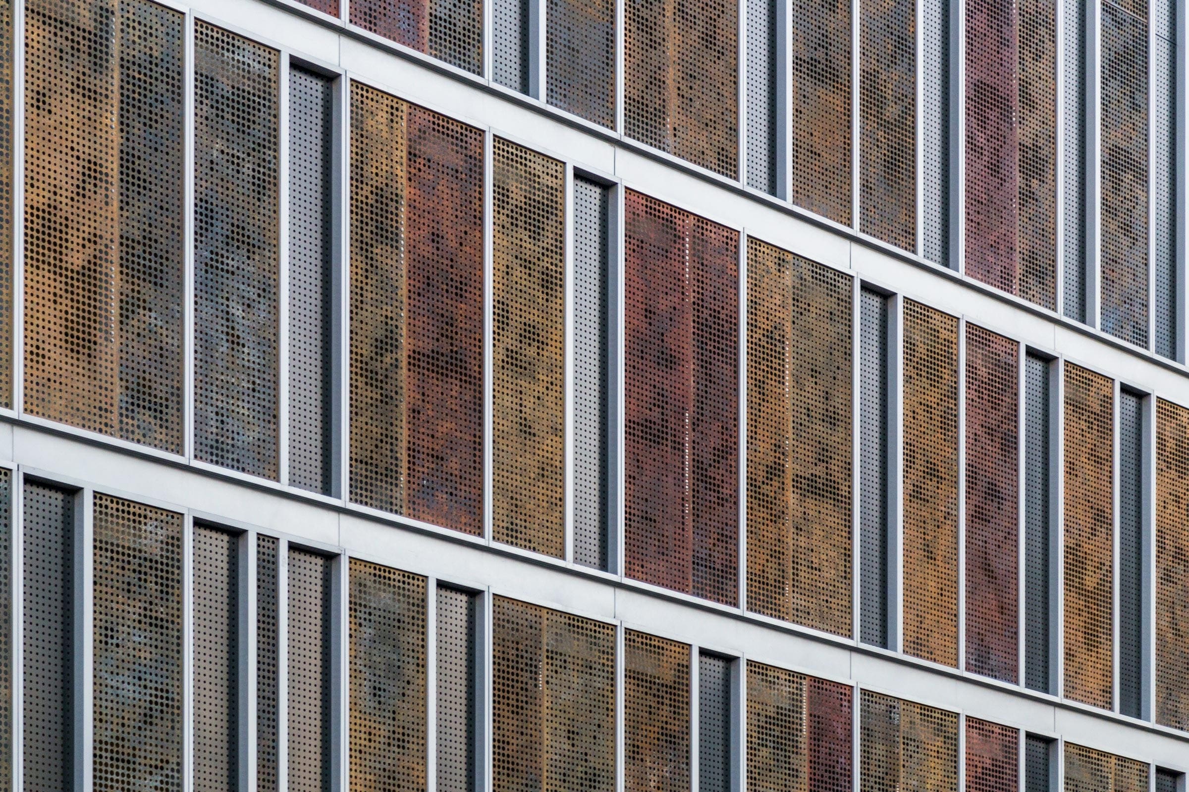
a31. Simons Center at Stony Brook University (Pictured top).
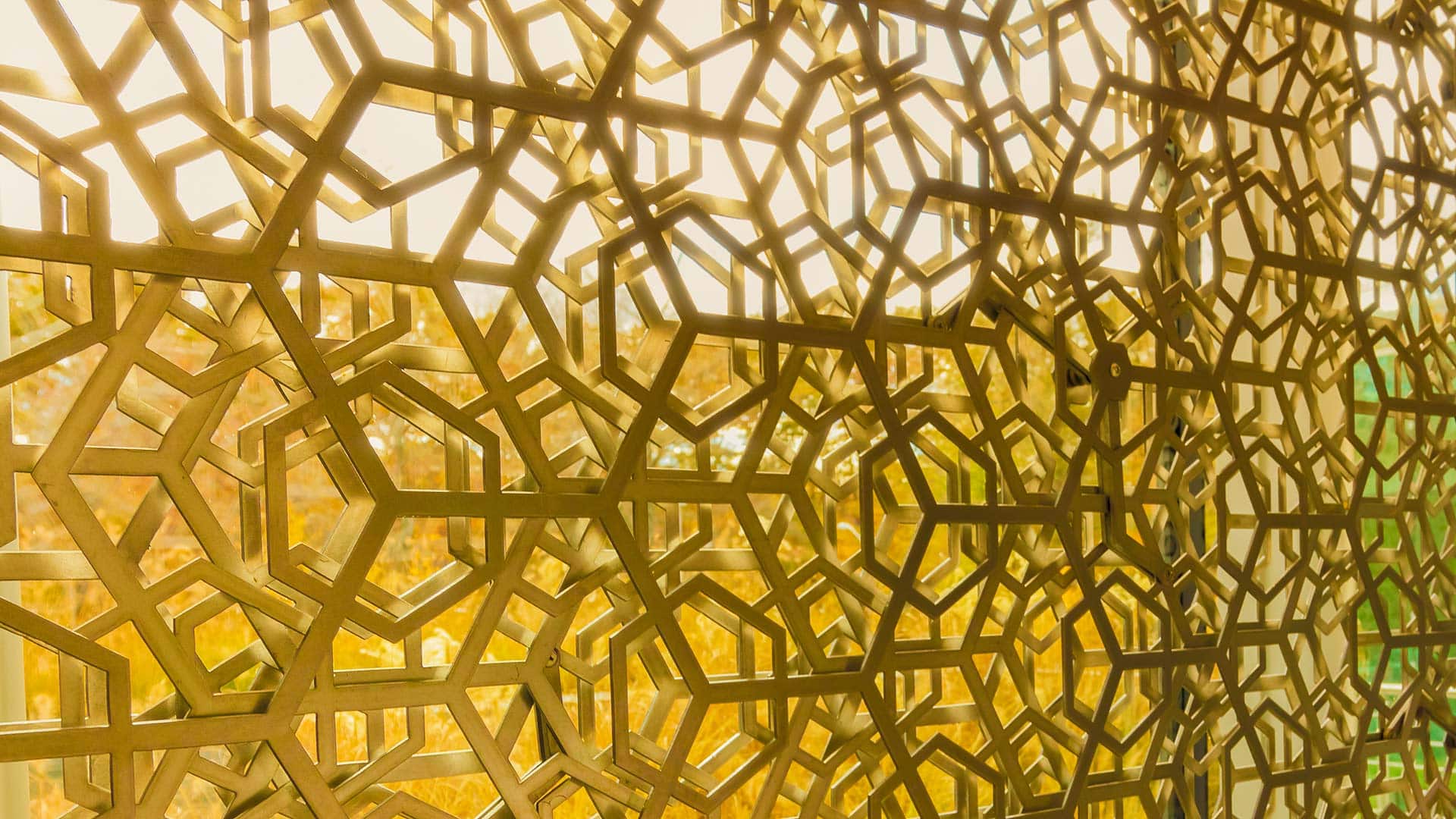
Working with Hoberman Associates, Zahner manufactured and installed a series of metal screen systems for the new Simons Center at Stony Brook University. Engineered in partnership with ABI and Buro Happold, the system provides an artistic and kinetic facade for the school’s creative student body.
The Future of Perforated Metal
The above projects provide a window into the wide range of possibilities available to designers working with perforated metal. The future is for those creative enough to push further and imagine boldly — and most important, to stand firmly in the name of design.
Want to see more custom perforated metal? We do too! You can see more featured projects completed by Zahner with perforated metal, or take a look at what designers are creating with ImageWall, a Zahner-patented perf generator for designing your own perforated metal systems.
Or, simply contact Zahner, and we’ll help you brainstorm your design, get pricing, and develop your project with the help of our engineer.

 PHOTO © Tim Hursley


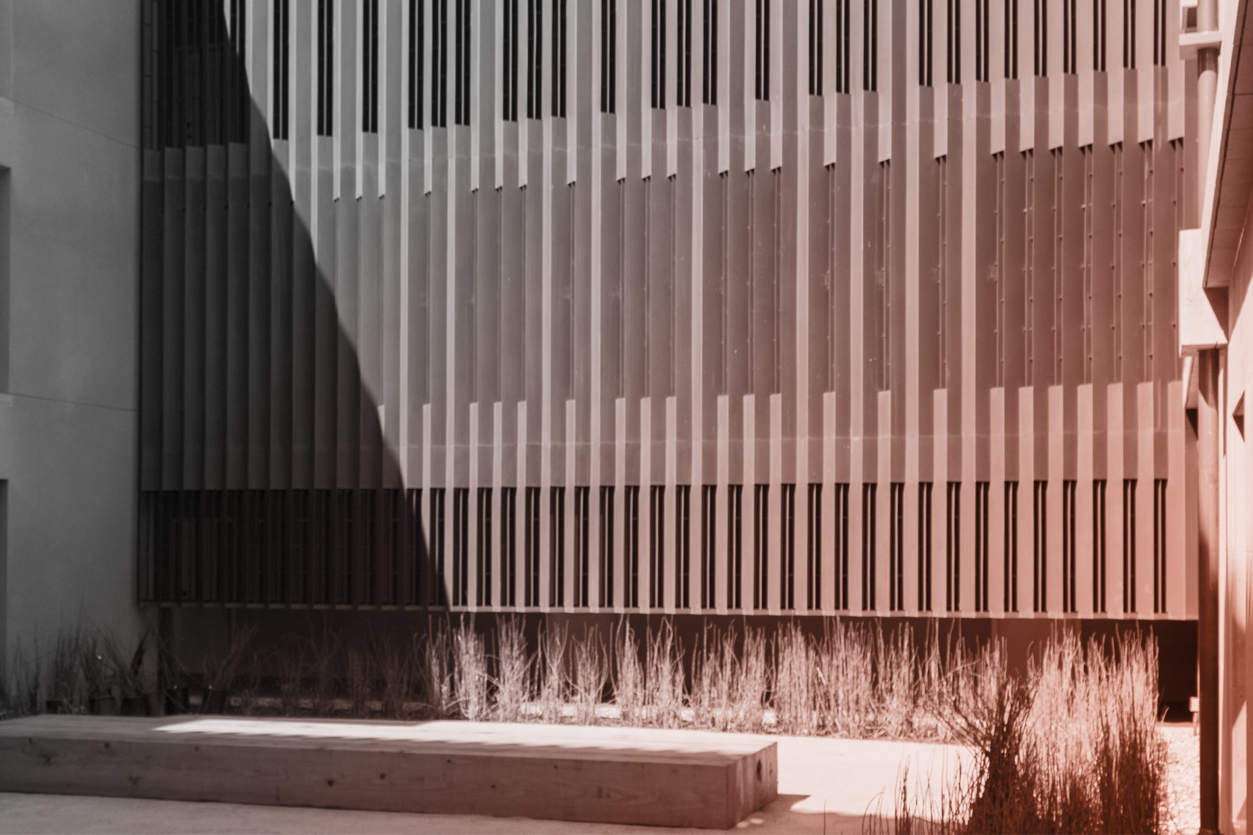
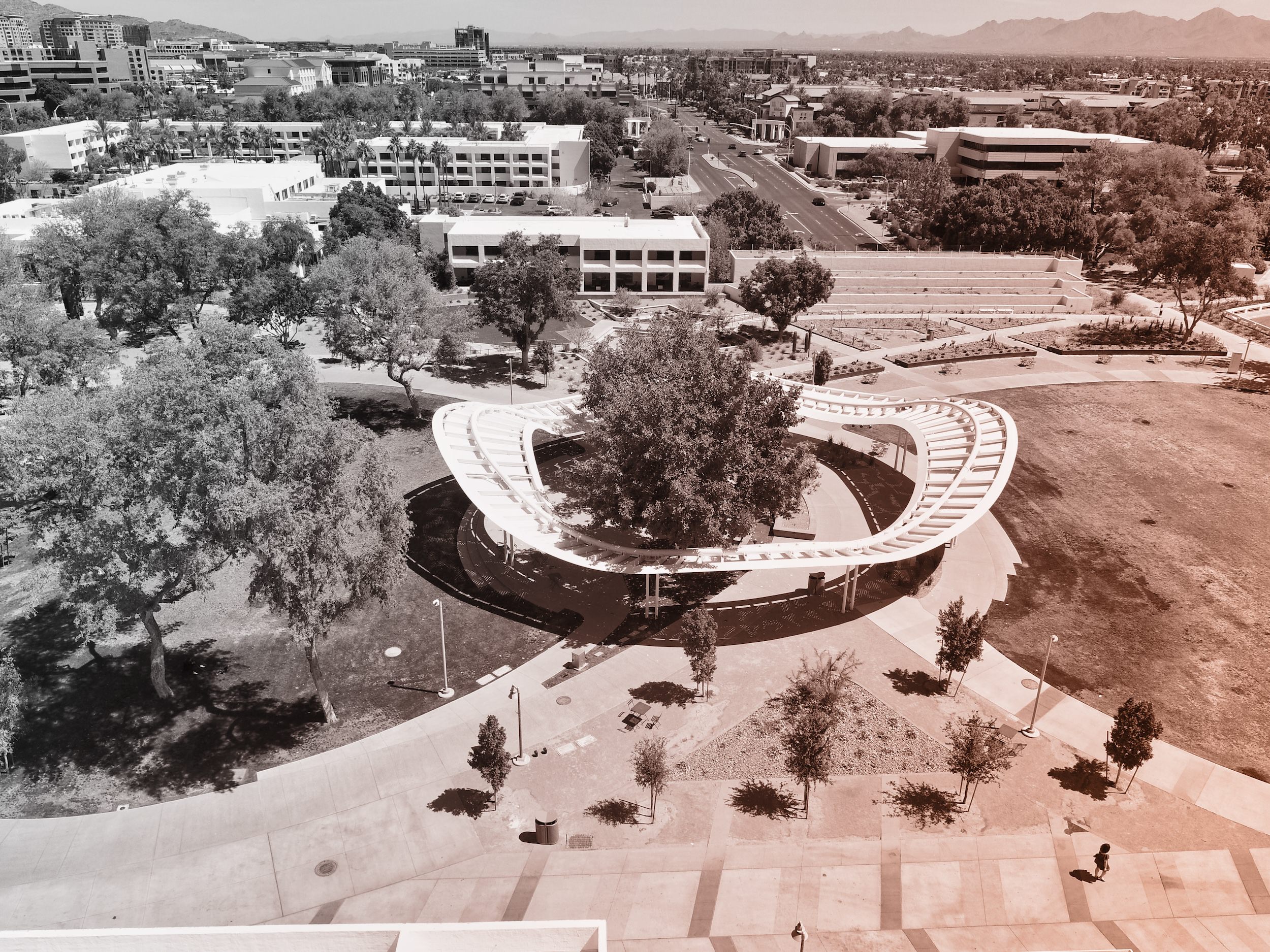
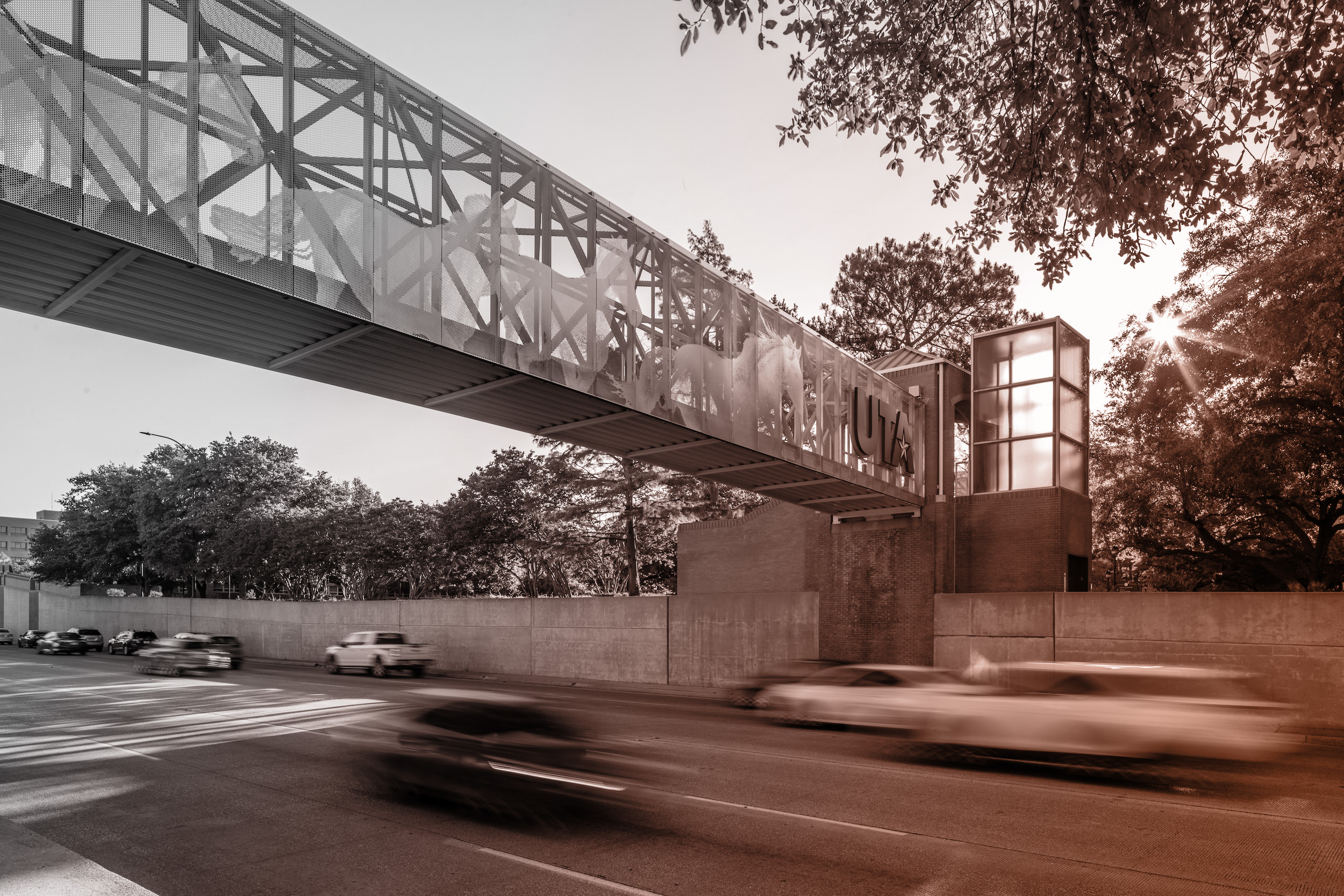 PHOTO ©️ Parrish Ruiz de Velasco (parrch.com)
 © Fedora Hat Photography
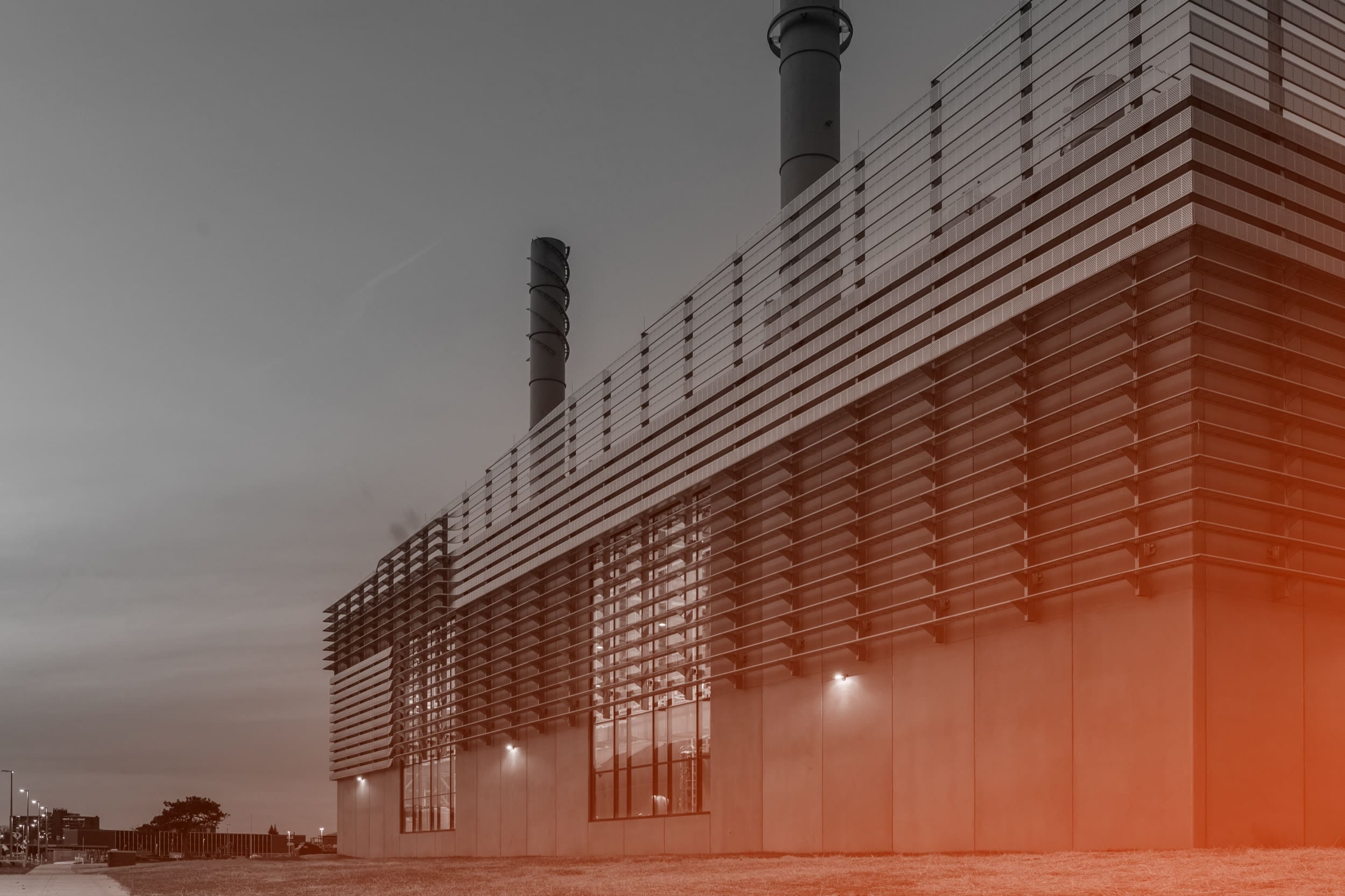 Photo by Andre Sigur | ARKO
 Ɱ, Creative Commons Attribution-Share Alike 4.0 International license, edited.